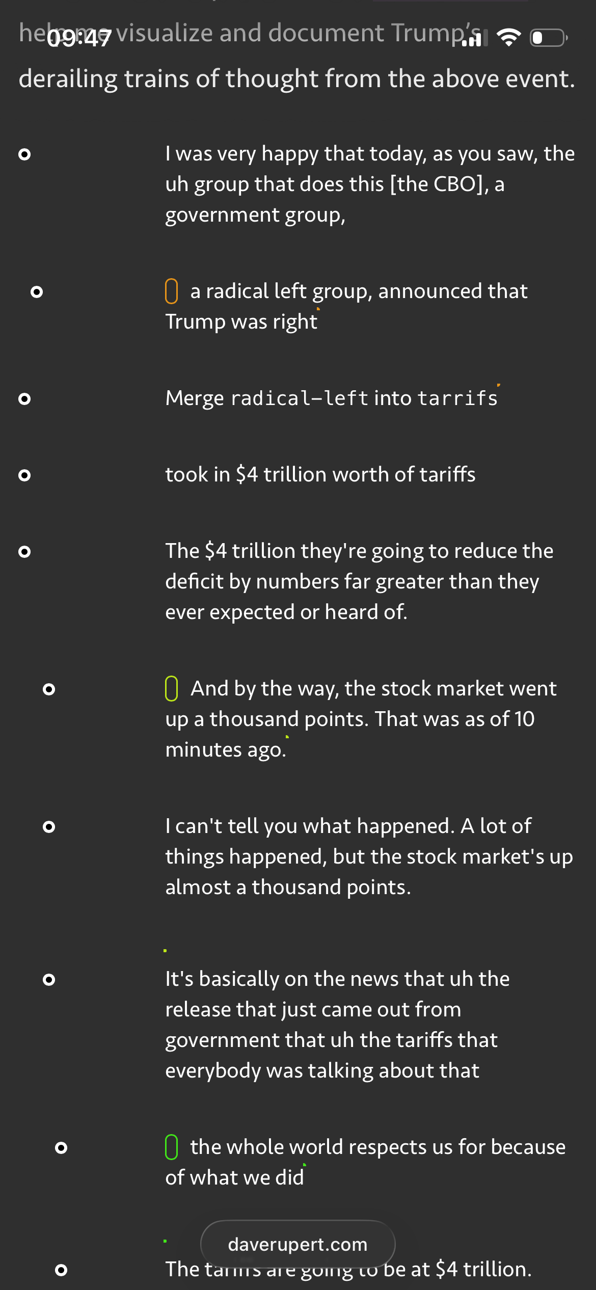
Git Diagramming "The Weave"
I think the diagram would be more comprehensible if the branch (topic) name would be shown next to the "New Topic" label, not only at merges. I had to read it from the bottom up the first time to understand what's going on.
That's funny. I'd like to see you do this more, on more of them. More diagrams! A good source is the introduction he gives at cabinet meetings. Or the way he answers questions with the press. You could compare with his campaign speeches and improvisations.
Does not render properly on iOS mobile (iOS 26 beta) https://files.nilsherzig.com/IMG_9236.PNG
There is a top-to-bottom mode and it works in their editor, not sure about the library: https://mermaid.js.org/syntax/gitgraph.html#top-to-bottom-tb
This would be interesting to psyhiatrists I believe. If you happen to make the code public I'm very interested (starting my residency soon)
This would be very useful for understanding business people who answer questions with endless word salad answers.
Reminds me of a flash game (branch) or tool, art or general "thing" perhaps (branch) I suppose it depends how you see it(return)(return) that I cannot not find (branch)such is the state of the modern web(return) (branch) something in the flavour of a Jared Tarbell piece (return) where you could type and the text would be displayed in a spiral in 3D space (branch) there was a way to make a branch a thought (branch) like this (return) and then return to the parent level. but even that wouldn't handle the weave (branch) not sure if that's a good thing or not (return)
Change over time. Get this done for 10y or more back non teleprompted lower edit recordings, chart and compare for some metric
Could we do this to Jordan Patterson? I feel like his branching really needs a git tree view to parse sometimes.
I wish people did more testing or at least acknowledged the limitations. I'd expected at list some level of diligence from Dave. This is half-broken in Firefox and looks like a regular nested list in Safari.
I understand it's made for personal use but if it's posted on the public web at least a disclaimer would've been nice.
Perhaps Sankey diagrams is a better way to visualise
We act like small models are inconsistent and incoherent, but we rarely point out that it actually matches certain mental states and capacity accurately. We may need to actually see, how would a 0.5B model handle the presidency, because … it could be accurate. Having a super large model simulate these things would not be authentic.
For example, it could be truly true that a developer is roughly as good as a 1.5b model. It could really be true, in which case we’re not valuing these models for their true simulation power (yet). Might be the best interview test, you must generate hand written code that’s better than a small model (or show better judgement).
For the presidency, the current benchmark to beat is GPT2 it seems.
An AI could generate them automatically and visualize the contradictions.
I talk like this. It’s an ADHD thing. All RAM no HDD. Just swap file thrashing like it’s 1999.
*made famous by Donald J. Trump
[dead]
[flagged]
[flagged]
Silly “hit piece” for lack of a better term on Trump. Do this with many conversations and you will have multiple branches of topic.
Someone I know speaks in a reverse tree of sorts which actually does resemble a "weave", they start with various statements about the topic at hand without ever mentioning the topic, and eventually arrive at stating the topic near the end (hopefully). Sometimes I have no idea what they are talking about because they forgot to mention it until the very end when they have merged all their branches.